
As web developers, we tend to think about code maintainability, the user interface, and meeting deadlines. What is often left unattended is accessibility and security. In this article, I would like to highlight some accessibility and security issues for the HTML Anchor element and how we can quickly solve these issues in our projects.
Opening Links in a New Tab or Window
Most web developers will know that you can open links in a new tab or window by setting the target attribute on an anchor to either _blank or _self respectively.
What is less known is how this impacts people using screen reader technology. The simple answer is that screen readers don't inform the user of this in advance and it can be frustrating when this happens unexpectedly.
There are several easy ways to solve this issue. Some people suggest using CSS or JavaScript to add hidden text through an :after selector or appending a <span> element inside the anchor indicating that the link will open in a new tab.
I believe it is important to warn users when a link opens a new tab — both visually and programmatically. There are two important subtleties to get right:
- Accessible name composition:
aria-labelreplaces the accessible name, it does not append to it. That means this is an anti-pattern:
<a href="…" target="_blank" aria-label="Opens in new tab">Example site</a>
A screen reader will typically announce only “Opens in new tab”, hiding the link purpose. If you use aria-label, include the visible text plus the hint, for example:
<a
    href="https://example.com"
    target="_blank"
    rel="noopener noreferrer"
    aria-label="Example website (opens in a new window)"
>
    Example website
</a>
Alternatively prefer aria-describedby or a visually hidden element so the visible text remains the link's accessible name and the hint is announced as supplemental information:
<a
    href="https://example.com"
    target="_blank"
    rel="noopener noreferrer"
    aria-describedby="new-window-hint"
>
    Example website
</a>
<span id="new-window-hint" class="sr-only">opens in a new window</span>
- Security: always include
rel="noopener noreferrer"withtarget="_blank"to avoid tab‑nabbing and related issues. This should be present in everytarget="_blank"example and implemented by any shared anchor component.
Best practice: centralize new‑tab logic in a small component or helper that adds the visual indicator (icon and/or visually hidden text), the rel attribute, and the accessible hint (via aria-label, aria-describedby or visually hidden text). This follows WCAG technique H83 / G201 on providing advanced warning when opening new windows.
View this pen on CodePen.
Using Proper Link Text
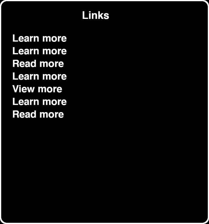
The same problem applies to the anchor text. It is not a good experience for people using accessibility tools if the only context they receive about a link is for example one of the following texts:
- Click here
- Read more
- More
- Click for details
- Find out more
This can make a lot of sense in the context of a web design, but definitely not in a screen reader user asking for a list of links on the page.
The same applies to using the actual URL as the anchor text. This is never a good idea.
If the visible link text cannot provide adequate context (for example a short “More”), then provide a richer accessible name. Important notes:
aria-labelreplaces the accessible name — so it must include the link purpose if you use it. Example:
<a href="/pricing" aria-label="More details about pricing">More</a>
- Prefer adding context in the DOM (visually hidden text) or
aria-describedbywhere possible so the visible text remains the canonical label:
<a href="/pricing" aria-describedby="pricing-desc">More</a>
<span id="pricing-desc" class="sr-only">More details about pricing</span>
- Avoid aria-labels that simply repeat visible text (it adds verbosity) and avoid providing an aria-label that omits the link purpose.
To inspect what assistive technology will see, use the Accessibility Tree in Chrome DevTools or tools like VoiceOver/NVDA while testing.

Do Not Capitalize All Letters in a Link
Making anchor texts fully capitalized can be an element of design for a link, or button which looks great in the UI. This is much more difficult to deal with for a screen reader. Often, screen readers will read the word letter by letter. Fully capitalized texts are usually combinations of letters that should be pronounced independently such as FBI, USA, UK, GB, and EU.
All‑caps text is a real readability and screen‑reader concern. A few practical refinements:
- Prefer sentence or title case where possible. Use all‑caps sparingly (short labels, nav items) and test it.
- Using
text-transform: uppercasekeeps the underlying text unchanged, which is usually better than editing the HTML. However, be aware that some screen reader / browser combinations may be influenced by CSS‑case changes; this is not a guaranteed fix. - Always test important flows with at least one screen reader (VoiceOver or NVDA) and multiple voices to catch pronunciation edge cases.
View this pen on CodePen.
Handling Image Links
It is generally not advised to use images as links. The context of the link is harder to convey to users, especially non-sighted users. However, if you need to use an image as a link you can at least portray the information as clearly as possible.
When an image is the only content of a link the alt attribute becomes the link text for assistive tech — therefore:
- Image‑only links:
altmust describe the link purpose or destination (e.g.alt="Download product brochure (PDF)"), not just the visual (e.g.alt="paper icon"). This aligns with WCAG technique H30. - Image + text: if the link contains both visible text and an image, typically make the image decorative (
alt="") and let the text carry the purpose to avoid doubling content for screen reader users.
Avoid using images as the sole means of conveying link purpose where possible.
Visually Distinguish Links From Other Elements
It is strongly advised to make links visually distinguishable from other elements on the page. The most common way to do this is to give the link another color.
The color of the link should be different enough that people with a form of color blindness can still distinguish the main text color from the link text color. The contrast ratio between the link and the surrounding text must be at least 3:1.
If you choose not to use a different color for links, underline or another non‑color indicator is required. A couple of clarifications:
- If links are always underlined, you do not need the 3:1 contrast difference between link and surrounding text — the underline is your non‑color cue.
- If you use color alone, the link must be distinguishable from surrounding text by at least 3:1 (technique G183) and both link and surrounding text must meet the normal text contrast minimum (4.5:1 for AA) against the background.
- Consider visited states: visited links should still be distinguishable from unvisited ones while preserving contrast and avoiding leakage of sensitive browsing history.
- A non-color indicator, such as an underline, must be present on hover
- The contrast ratio between the surrounding text and the background must be at least 4.5:1
- The contrast ratio between the link and the background must be at least 4.5:1
- The contrast ratio between the link and the surrounding text must be at least 3:1
Focus Styles
When users navigate through a website using their keyboard, they should have clear focus styles to indicate what they are currently focusing. It is very common in modern web development to remove the default browser outline styling which is used on focus.
You must not remove focus indicators without replacing them with an equally visible alternative. A few concrete patterns:
- Use the
:focus-visiblepseudo‑class to show focus for keyboard users while avoiding outlines on mouse clicks. - Ensure focus indicators are thick/visible (≥ 2px where appropriate) and meet non‑text contrast requirements (WCAG 1.4.11). Use high contrast colors and consider an outline plus a subtle box‑shadow or background change for clarity.
Example:
a:focus-visible {
    outline: 3px solid #0a66c2; /* high contrast */
    outline-offset: 2px;
}
Conclusion
It is very important for web developers to think about the accessibility of their websites. It takes just a little bit of effort to immensely improve the experience of users who are using a form of assistive technology.
I hope you have learned something from this post. If you have any additions or feedback, please let me know in the comments.
Additional topics worth considering
These short pointers are useful follow‑ups to the tips above:
- Links vs buttons — links navigate (change location/URL), buttons perform actions. If an interactive control performs an action, use a
buttonwith appropriate keyboard behavior andaria-pressed/aria-expandedas needed. - External / non‑HTML resources — indicate when links go offsite or will download a file (include file type and size where helpful). This sets expectations and helps users decide whether to follow the link.
- Security — reiteration: with
target="_blank"always userel="noopener noreferrer". - Skip links / in‑page navigation — expose a visible (or focusable) skip link for keyboard users to jump to main content.
- Touch targets — ensure tappable links and buttons meet minimum target sizes (≈44×44px) on mobile.
- Testing checklist — test critical flows with VoiceOver (macOS/iOS) and NVDA (Windows), inspect the Accessibility Tree, and run automated checks (axe, Lighthouse, WAVE) as part of your QA.